After hearing about this organization on social media, I decided to revise their logo and entire brand identity for free as a sign of my love for animals and what they do for animals.
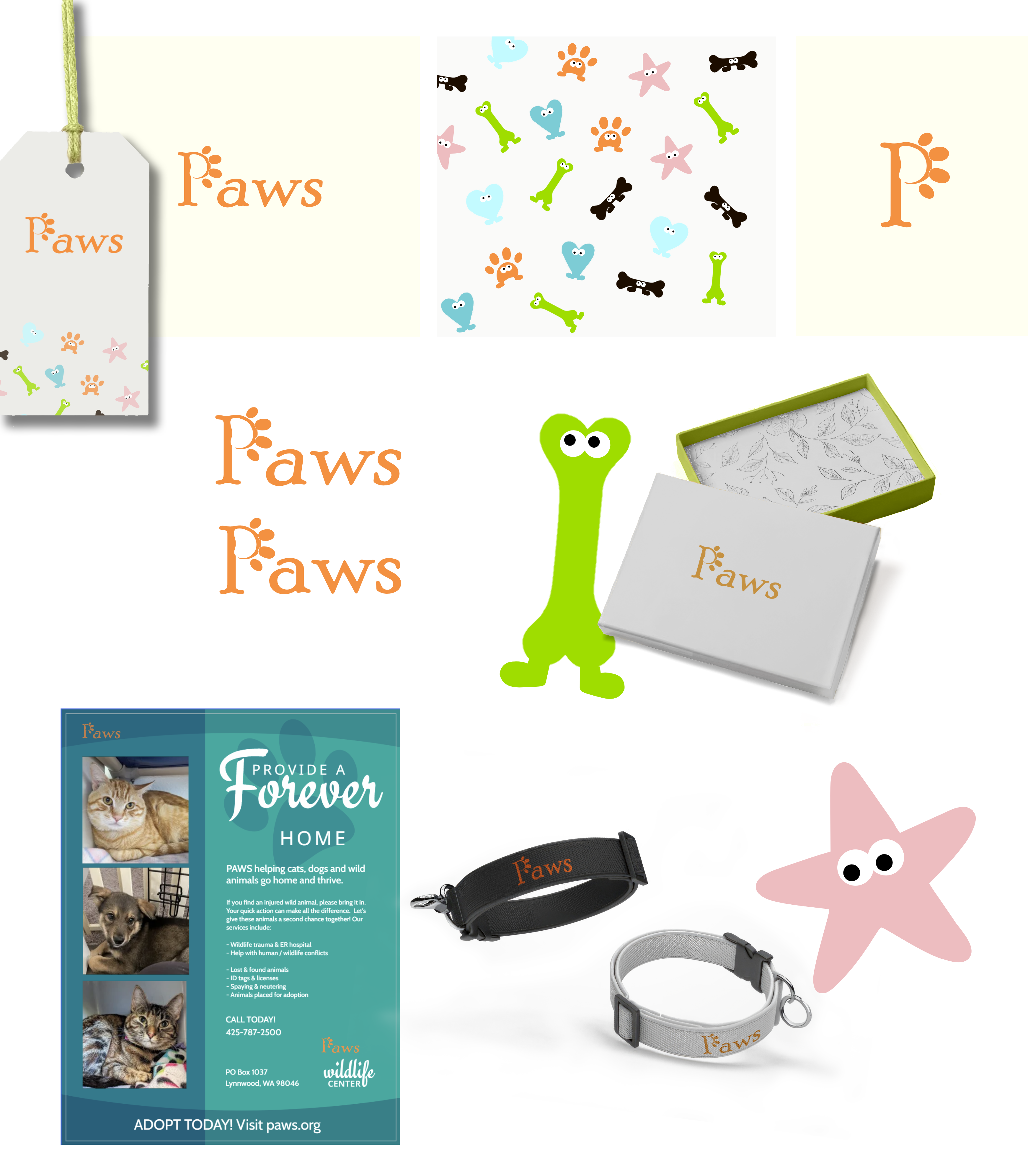
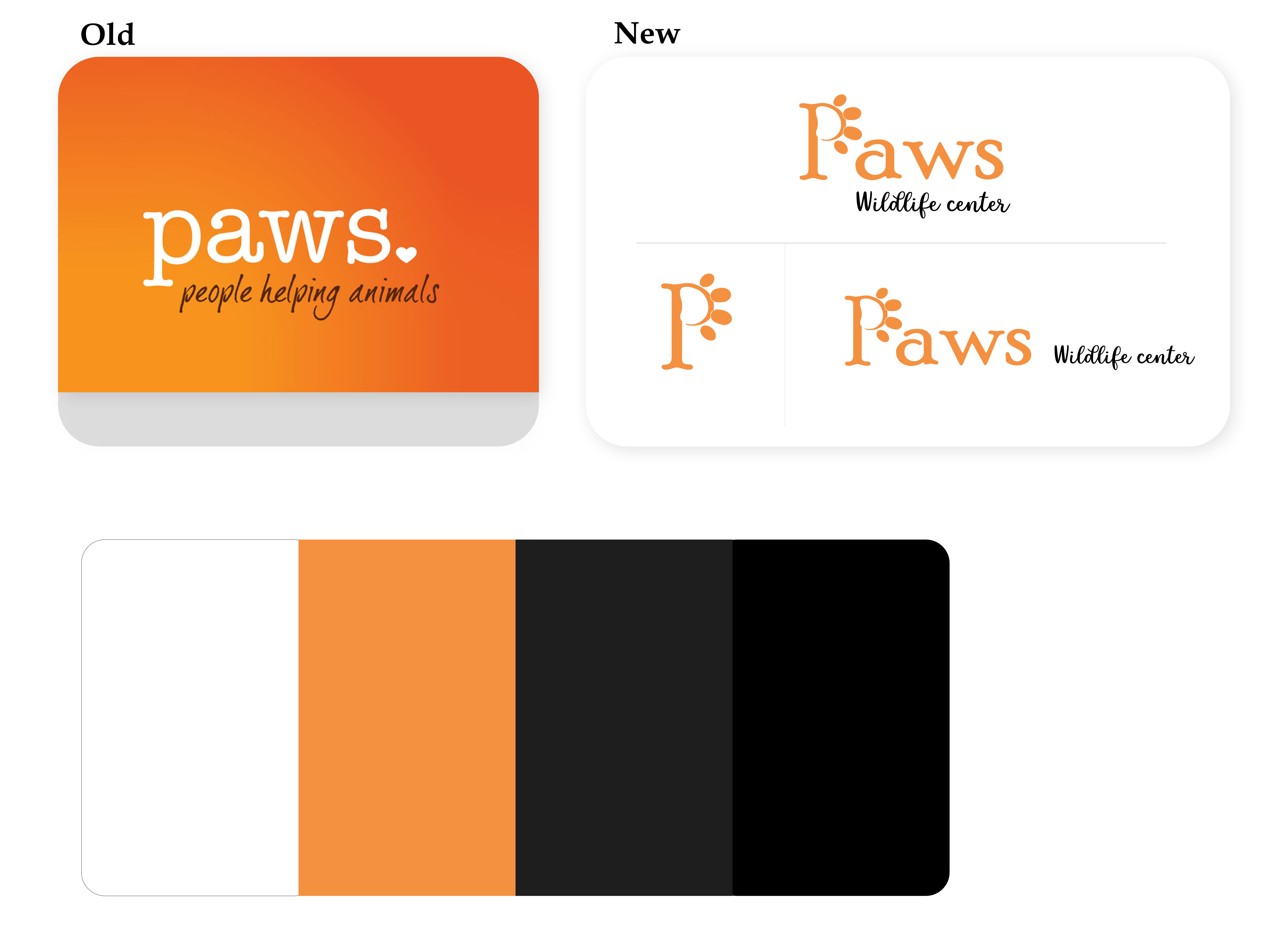
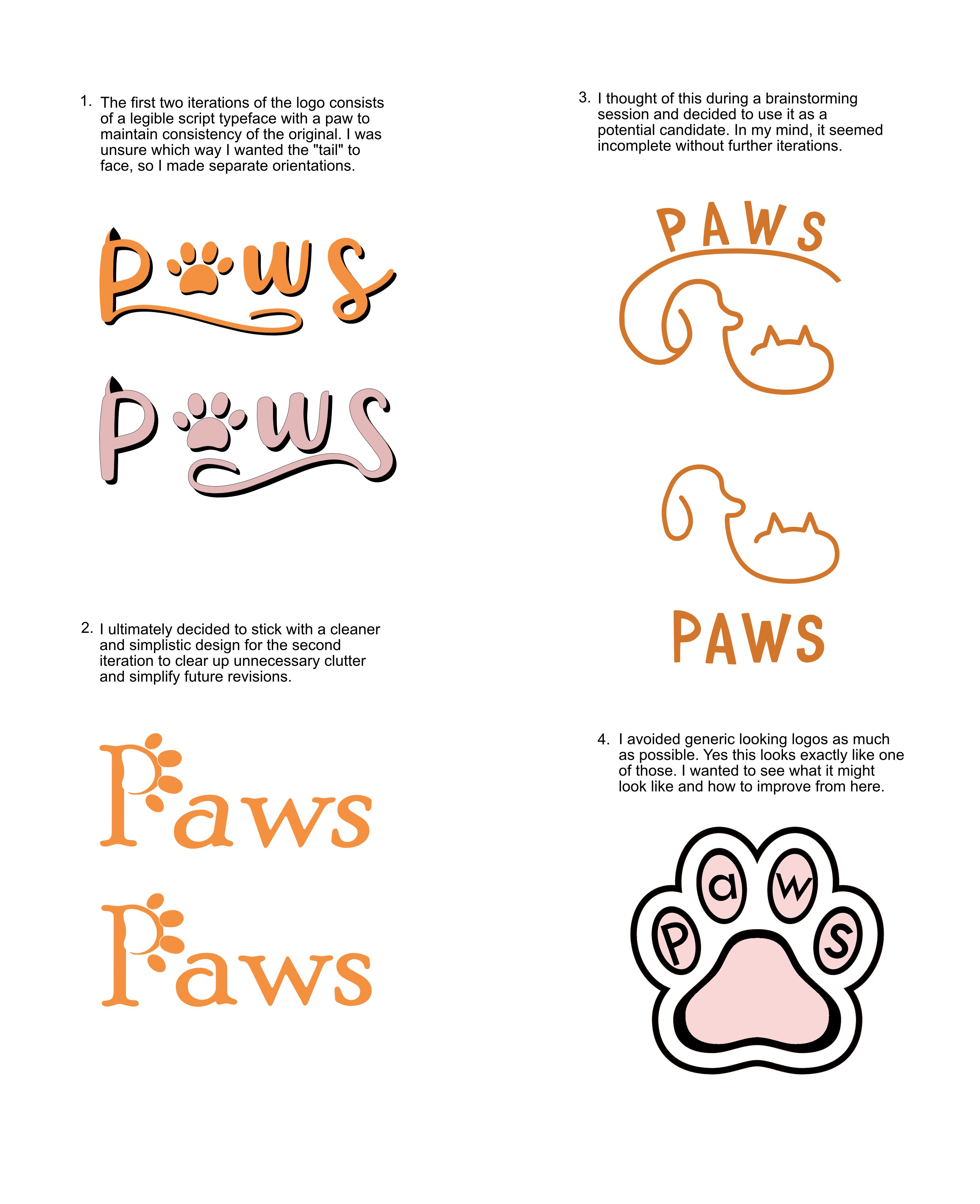
I overhauled Paws' branding from top to bottom. Starting with the logotype, I wanted it to stand out from others by integrating a paw shape into the typography. Their mission states that they adopt and rehabilitate animals, and I kept that in the back of my mind while designing it.
A highly legible script typeface was used for added personality, and the heart icon was removed for a cleaner look. Next, I brought in a warm color palette, inviting fonts, and established a hand-drawn illustration style that was used to develop the organization's key art that’s seen across the branding.
Before getting started, I drew up a mood board to organize my key findings
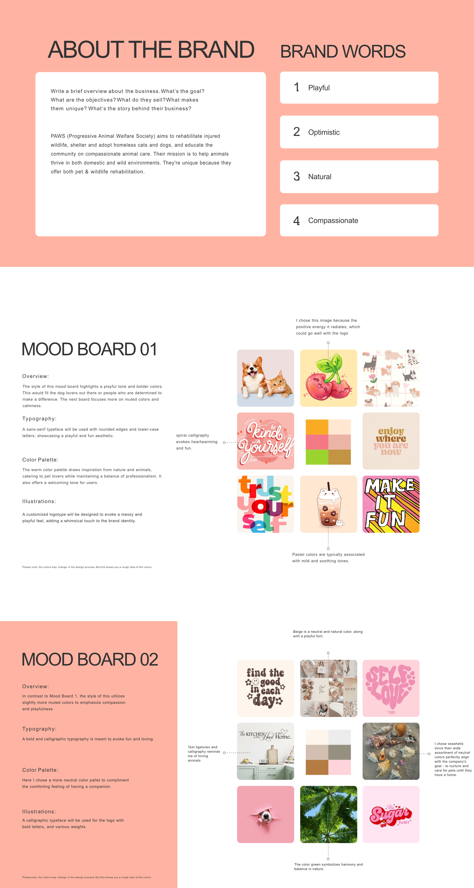
Several adjectives came to mind when conceiving what an adoption and rehabilitation center may entail.
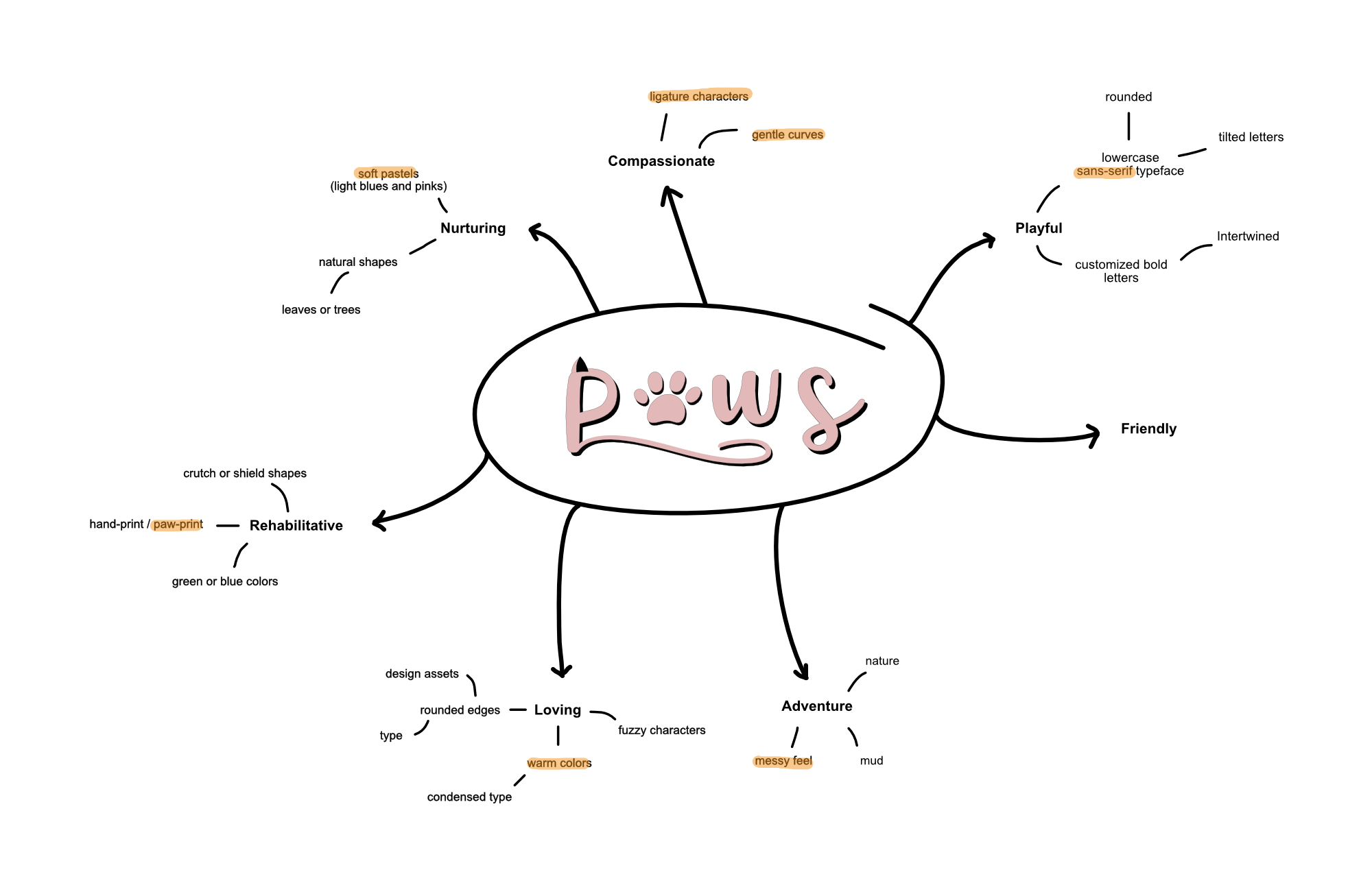
A few other logo ideas I brainstormed

© Matthew Pittman 2023